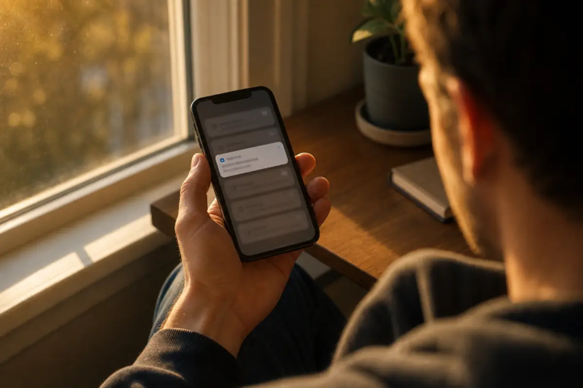
Mobile notifications can be useful reminders, timely status updates, or fast paths to an important action. They can also become a steady source of interruption when a product treats every event as equally urgent. Reviewing examples of mobile app notification UI design can help teams see how different products organize alert content, actions, and priority without overwhelming the screen.
In 2026, respectful notification design is a product decision, not a final-stage copywriting task. An alert competes with work, study, travel, conversations, rest, and everything else happening around the user. The goal is not to create more reasons to open an app. It is to deliver the smallest useful amount of information at the right time.
Why Notification Design Needs More Care
Frequent alerts can make even a valuable app feel demanding. A user who receives several low-value updates may mute the entire category, disable notifications altogether, or lose trust in messages that genuinely matter. Useful alerts respect the fact that attention is limited and that people should remain in control of their devices.
A good rule is simple: a notification should help someone know, decide, or act without requiring unnecessary effort. If an update exists only to encourage a return visit, it deserves extra scrutiny. Product teams should distinguish between information that serves the user and messaging that serves a short-term engagement target.
Start With a Clear Notification Purpose
Define the User Need
Write a one-sentence purpose for every notification type before designing the screen or drafting the copy. For example, “Tell the customer that a payment requires attention before the due date” is a meaningful purpose. “Bring the customer back to the app” is not enough on its own.
Then ask three questions: What changed? Why does it matter to this person? What can they do next, if anything? If the team cannot answer those questions clearly, the notification is likely unnecessary or should appear inside the app instead.
Sort Alerts by Value
- Critical: Health, safety, security, or account events that may require immediate attention.
- Time-sensitive: Updates that matter within a short window, such as an arriving ride or an expiring reservation.
- Useful: Information worth seeing, but safe to review later, such as a weekly summary.
- Optional: Promotional, social, or discovery messages that should be explicitly enabled and easy to disable.
Match Timing to Context
Urgent information should arrive promptly, but lower-priority updates should wait for a natural review period. Consider local time, known quiet hours, recent activity, and whether the user has already completed the related task. A person who has just paid an invoice should not receive a payment reminder five minutes later.
When several events occur close together, combine them into one useful summary rather than sending a stream of separate banners. Grouping should reduce noise, not conceal important details. For ongoing updates, show the newest and most relevant information first, while preserving truly urgent alerts as individual messages.
Write Messages That Work at a Glance
Notifications are often read while a person is doing something else, so lead with the event or change. Add the key detail next, then offer a clear action only when it will save time. “Your pickup is ready at Market Street. Show code” is more helpful than “Great news! Your order has an exciting update waiting for you!
Use plain language, complete thoughts, and specific facts. Avoid vague urgency, excessive punctuation, internal product terms, and manufactured excitement. Platform guidance on concise, informative notifications reinforces the same principle: people should be able to understand the update quickly without opening the app.
Build a Strong Visual Hierarchy
Make the sender recognizable, separate the title from supporting information, and keep timestamps easy to find. Color, badges, sounds, and haptics can clarify status, but they should not be the only signals of importance. A notification must still make sense when color is unavailable, sound is muted, or text size is increased.
Test each alert on small screens, with large text settings, in dark mode, and with truncated previews. Standard system patterns are usually safer than elaborate custom layouts because they remain more consistent across devices. Android guidance recommends using standard notification templates to preserve readable layouts across screen sizes and versions.
Give Users Meaningful Control
A single all-or-nothing notification switch forces users to accept too much or lose too much. Offer categories such as account and security, reminders, order status, social activity, and promotions. Explain what each category includes before asking for permission, and make choices available within the app as well as in system settings.
Support quiet hours, delivery schedules, temporary muting, preview controls, sounds, and vibration preferences where appropriate. Confirm when a setting has changed, then respect it. Repeatedly asking a person to re-enable a muted category turns a preference screen into a pressure tactic.
Design for Accessibility and Privacy
Support screen readers with useful labels and logical reading order. Keep text readable at larger system sizes, use more than color to communicate status, and make action labels direct. An action such as “Snooze 10 minutes” tells the user what will happen more clearly than “Manage.”
Privacy deserves the same attention. Lock screens and shared spaces are not private environments, so avoid exposing health details, account balances, verification codes, addresses, or sensitive conversations by default. Give users a clear choice about whether previews appear on the lock screen.
Measure Helpfulness, Not Just Engagement
A high tap rate does not automatically mean a notification was successful. Track whether users complete the intended task, whether they act later without tapping, and whether the alert reduces support requests or missed deadlines. Also watch mute rates, opt-outs, dismissals, and changes to notification settings.
Pair quantitative signals with direct feedback. Ask users whether messages feel timely, understandable, and easy to control. If a notification drive opens but also causes a spike in muting, the design may be extracting attention rather than creating value.
Common Mistakes to Avoid
- Sending an alert for every minor account or activity change.
- Using the same sound, badge, and visual treatment for every priority level.
- Hiding the main detail behind an app launch.
- Sending promotions without clear permission.
- Repeating alerts after the user has already completed the task.
- Ignoring time zones, quiet periods, accessibility settings, or lock-screen privacy.
A Practical Review Checklist
- What user problem does this alert solve?
- Does it need to arrive now?
- Can the user understand it without opening the app?
- Is the requested action useful and clear?
- Can the user mute or adjust this category easily?
- Does it work with accessibility settings and protect sensitive information?
- What evidence will show that the notification helped?
Conclusion
Effective notification design is not about sending more alerts. It is about sending fewer, clearer, and more useful messages. When teams respect timing, context, privacy, accessibility, and user choice, notifications become a supportive part of the experience instead of another demand on attention.
Also Read
- How Blockchain Technology Works in Simple Terms
- Improving Patient Experience with Modern Appointment Scheduling Solutions
- Snow Bunny Meaning Slang